
NHS login
Timeframe: June 2018 - Now
Role: User Researcher
Research and design team: Claudio Pires Franco (Senior User Researcher), Emma James (Content Designer), Rachel Hanna (User Researcher), Chris Ball (Senior Interaction Designer), Lydia TeeBay (Interaction Designer), Patrick Dennehy (Senior Content Designer), Ian Arnison-Phillips (Senior Content Designer), Will Hepworth (Interaction Designer)
My primary responsibilities: User recruitment, creating research studies, moderating user research sessions, analysis of quantitative and qualitative data, facilitation of insights playback sessions, accessibility, heuristic evaluation.
Outcome:
Significantly improved accessibility to WCAG AA rating
Reduced journey time by 40%
Improved conversion by 5.2% (to 95.6% overall)
Improved verified profiles by 21% since project inception
Overview:
For a user to take greater control over their health, they need access to their healthcare records and data. A high level of trust is needed that the user is who they say they are before they can access their records, which is where NHS login comes in.
You can think of NHS login as the healthcare equivalent of a Google or Facebook single-sign-on (SSO), which can be used across various different healthcare services.
We needed an improved easy to use registration flow experience for NHS login. Partner services such as the NHS App were receiving poor app-store ratings due to the sign-up process.

NHS login promotional video
NHS login is an identity authenticator service. It checks who the user says who they are.
The goal of creating an NHS login is a single re-usable account across multiple digital healthcare services, such as the NHS App, EMIS, or Ask NHS.
I’ve been working within the NHS login research & design team since the early stages of private beta. In the early stages, we had 5 people within the research and design team on this project and have since scaled to roughly 20 people within the R&D team, comprised of interaction designers, content designers, user researchers, and product managers, within a service team of roughly 90 people.
My role within this team is primarily focused on the user registration and ID document registration portion of the user journey. This aspect of the service is the most critical for users receiving a verified account via uploading their identity documents.
My main objectives on this project are to:
Enhance the accessibility and inclusive design of the service
Increase conversion of verified accounts
Improve the users conceptual understanding of the service
Diving into the analytics
One of my responsibilities was to focus on the registration flow - how a user signs up before they need to prove who they are.
I joined the NHS login team when the service was already in private beta as the user sign-up and verification process for NHS App. Shortly after joining the team as one of its first user researchers, I collaborated with our team to take stock of how the product was performing by studying metrics available to us on platforms such as Splunk, Hotjar, and Adobe Analytics.
Enhancing the registration process would have a compounding effect on the rest of the service in terms of addressing the initial drop-out rate as well as the share of users who go on to confirm their account and later go on to verify their ID (a successful final journey).
Baseline analytics in private beta

After analyzing the data from Splunk, Adobe Analytics, and Hotjar, as a team, we created several hypothesis statements to move forward with user research in usability lab sessions.
At this stage, I was responsible for creating research plans, moderating user research sessions, and hosting insight playback sessions for the R&D squad I was embedded within.
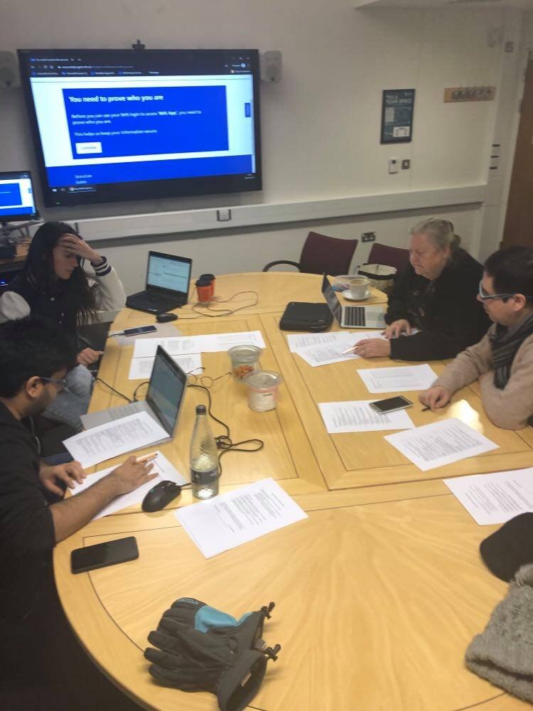
Lab research with NHS login
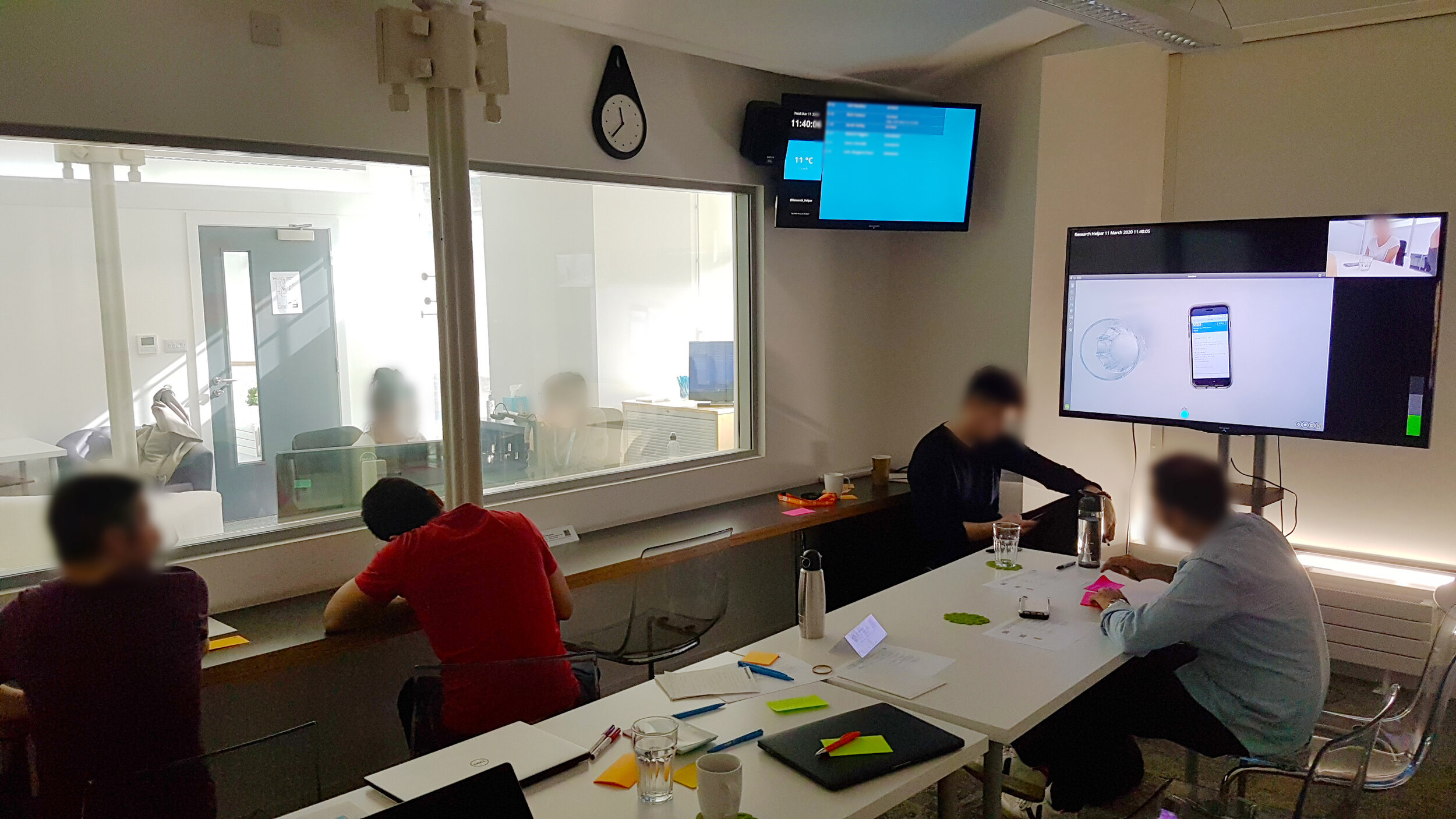
lab research session with members of the NHS login research and design team

affinity diagram from a lab research session
After triangulating quantitative service data with qualitative research lab session insights, the following themes of problem areas started to emerge.
ID Document Rejections:
The main reason for photos of ID documents for verification being rejected was that users were not taking a clear picture.
Photos were either blurry, cut off, glare obstructing text, or watermark being overly visible and obstructing document details. We observed users struggling to take a clear photo of their ID document in lab sessions and had substantial quantitative data showing rejection reasons in Splunk.
With this evidence base, I worked with the design team on future design iterations and research cycles focused on this problem.

Quantitive analysis using Splunk focused on ID document rejection categories
Inaccessible design:
We knew from research with visually impaired users that the current username, password + confirm password page isn’t very accessible. This is due to too many field inputs on one page. If a user enters one field incorrectly, multiple fields present on the page makes it difficult for them to correct their error.
We also found that blind and partially sighted users were unable to take a clear photo due to the ID document upload portion of the service being incompatible with screenreaders and lacking audio feedback.
For a user with cognitive impairment, inputting so many things on one page can be a tiring and confusing experience. It would work better for all users if this page was broken down. We also found that users can become frustrated when registering that they can’t see the password they have entered, resulting in an increased rate of errors.
I also lead a research workshop with Leeds Deaf Forum, in which we found the design patterns for the response challenge to be inaccessible for deaf and non-speaking people.
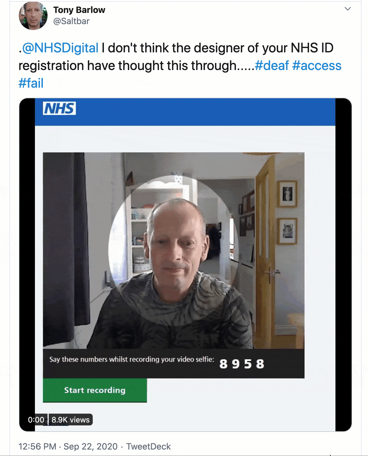
We knew this was a problem area within the service. A non-speaking user on Twitter shared his thoughts on the authentication challenge response portion of NHS login
No preparation for onwards journey:
The registration process wasn't the final step in the user’s journey, they needed to continue and prove their identity. This involves taking a selfie, a face scan or video selfie and a photo of their ID for it to be matched to.
Users only found out they needed to do these steps later on in their journey, causing a significant amount of frustration and dropoff as observed in analytics. Not every user had the time or appropriate social setting to take a photo of themselves and their identification, never mind a video or face scan.
There's an inherent level of complexity and preparation (having the necessary documents ready) needed that we need to help users with. We needed to better align with the conceptual model with the users mental model.

I worked with our content designers and interaction designers to test and research various iterations of a start-page concept to better prepare users for the journey ahead and to set expectations. The service needed to prepare users for what to expect. We knew from research that many users are not prepared for the complete verification process and that when a user got to the step they needed to take a photo of their I.D. they didn't always have it to hand. This frustration was confirmed by a high drop-off rate (the second highest in the service).
We designed different variations of this page based on whether the user was going through the full authentication process or a user journey which required a lower level of authentication.
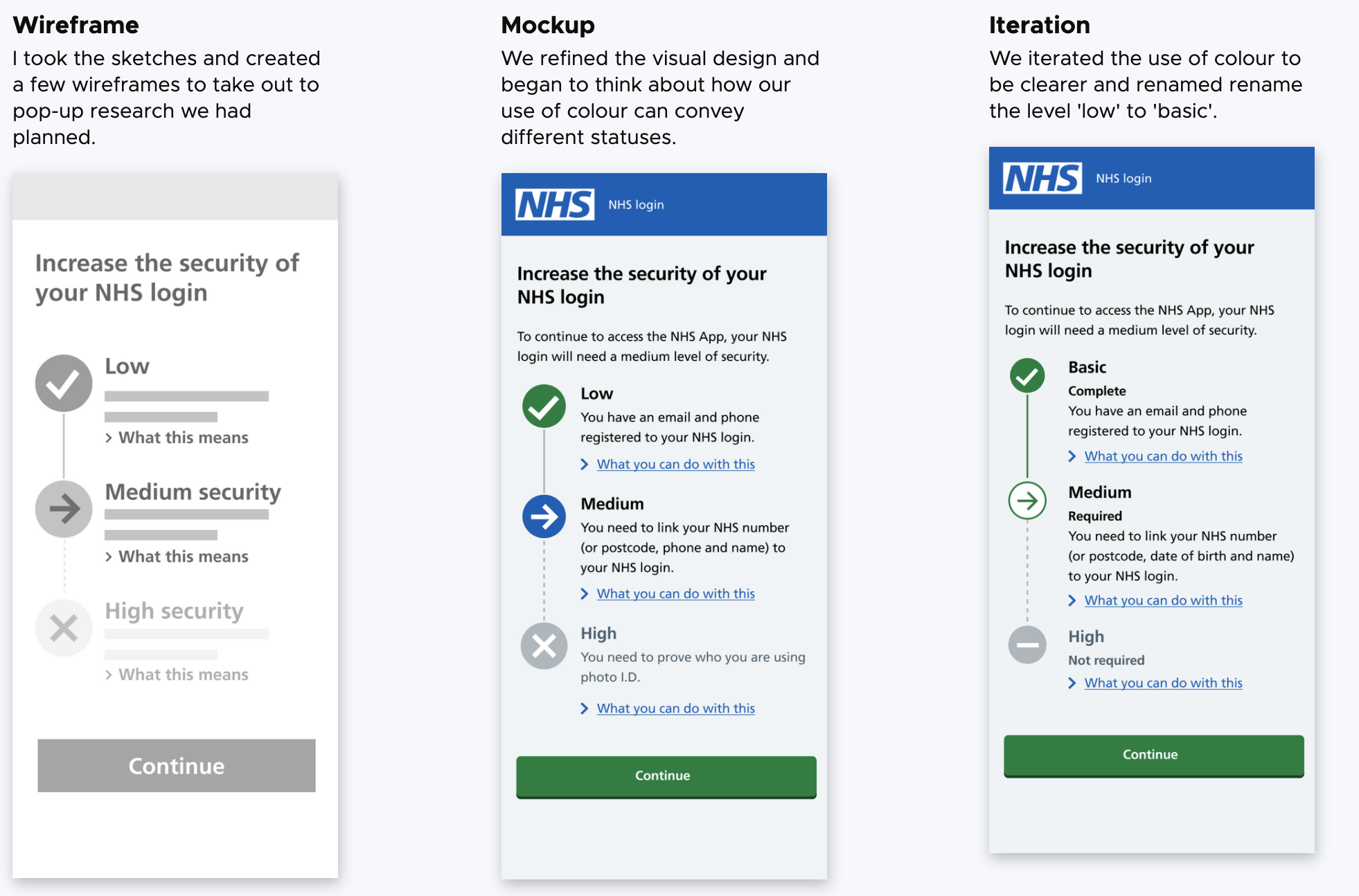
We needed to match a users mental model about how they think of their accounts security. Because NHS login is designed to be reused across different healthcare services, who each need a different level of account security, we needed to communicate to a user why some services sometimes asked for more information.
We created the concept of security 'levels' which explained the users current level, the level they needed to use the service they were signing up for, with information about why it was needed.
Design iteration based on continuous research insights

A user journey map was created based on the insights from research focused on the sign-up portion of the service.
We used artefacts such as these to align the team on strategy and keep up-to-date service evidence visible.
I worked with a data scientist and designer on our team to create a new journey map of the service every fortnight, in which we overlayed insights such as dropoff analytics, service usage in Splunk, insights from Hotjar, qualitative feedback from user research.
I regularly ran research ideation and iteration sessions with my team after each research cycle.

As a research and design team we regularly held insights sessions and design critiques
As a team, we follow agile principles. Meaning we prioritise fast design iteration based on user insights, rather than bloated rigorous documentation.
This means we are able to ship quickly, run experiments, and make changes based on various pipelines of real-world data.
Research insights were regularly shared with product managers, developers, and other members of the wider team in formal and informal manners to ensure insights stayed visible within our team and we were making user-centred evidence-based decisions as a team.
Making the service accessible and inclusive
Being that I was the one leading on accessibility enhancements for the service and making design inclusive for all users, I identified a range of areas for research activities that could be carried out in order to gain insights for accessibility enhancements.
This included:
A Digital Accessibility Centre (DAC) Audit of the service
A collaborative heuristic evaluation at the Computer Science Department at the University of York with Professor Helen Petrie, who is a world-leading expert in accessibility and inclusive design.
On-going research cycles with people with access needs. This included remote and in-person studies with people with visual impairments, deaf and non-speaking users, people with motor-skill impairments, and cognitive disabilities.
Collaborative heuristic evaluation
collaborative heuristic evaluation at the Computer Science Department at the University of York
These research activities generated insights which lead to product iterations such as creating a response challenge that was inclusive to all users, regardless of impairment or disability. Users now have the option to say, sign, or write down the challenge response.

Design iteration based on accessibility research, giving users the option for different challenge responses they feel most comfortable with.
I also lead accessibility research focused on registered blind and visually impaired users. I hosted pop-up research sessions at RNIB and Kirkless Visual Impairment Network focused on service usability. I also ran several moderated and unmoderated remote research sessions with blind and visually impaired users.
These efforts lead to various accessibility enchantments of the service for visually impaired users, such as audio guidance for the ID document picture journey, as well as improved screen reader compatibility. This research was also summarised into a research paper I presented at the conference International Conference on Software Development and Technologies for Enhancing Accessibility and Fighting Info-exclusion.
Analytics that informed design iteration for response challenges

On-going content design and interaction design iterations were regularly being made to the challenge-response portion of the service based on analytics.
Decreasing ID Document Rejections
From both qualitative and quantitative research, we found that ID rejections were a major problem area within the service with many people getting rejected from having an authenticated account due to poor photo quality.
Working with the development team, content designers, and interaction designers on my team, we iterated on a design pattern in which users are shown an example of a clear photo and asked if the picture they took was clear. This reduced burden on manual ID checking staff and increased the number of users that were uploading a clear photo.
The R&D team also worked with developers to work in an SDK function that detects blur and IDs that are taken out of frame. Which notifies them during the journey so they can make changes.
Using a mixed-methods approach, we would analyse incoming data in Splunk, VWO, Hotjar, and Adobe Analytics and test any new design iterations in the field with users.

Weekly analytics ‘dashboard’
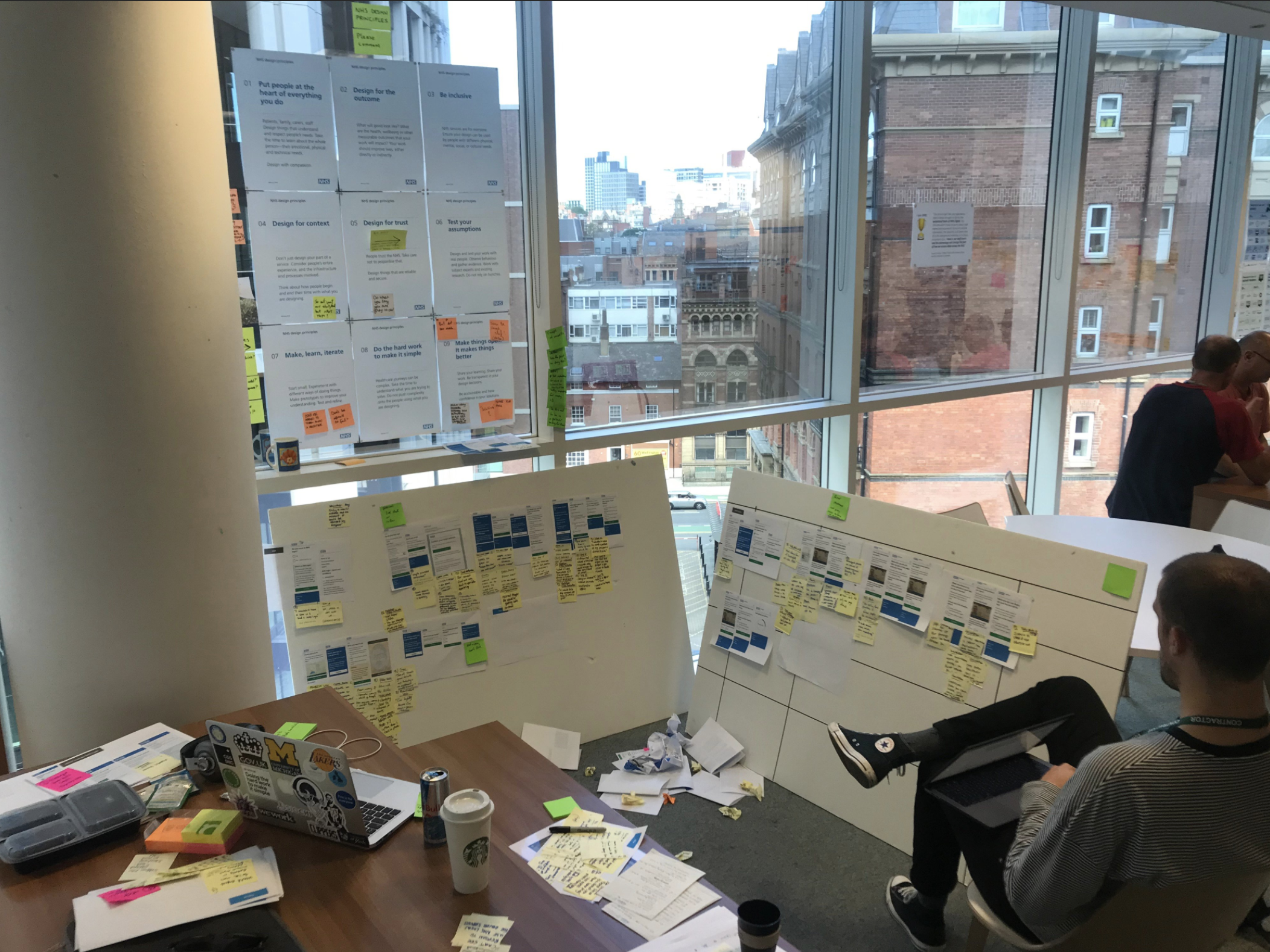
As a team, we would use remote collaboration platforms such as Miro to run design workshops and iterate on concepts we were researching. This gave us alignment and visibility of ongoing design interactions and concepts as we worked remotely during the COVID-19 pandemic.

remote collaborative design workshop in Miro iterating on ID verification design concepts
Reflection
I am currently still working on NHS login. Scaling the research and design team from 5 people to over 20 has been a rewarding experience. Working on strategic frameworks for research ops within NHS login has been challenging but rewarding. Taking this service from its inception to scaling it to half of the public in England (28 million active users as of October 2021) has been hard work.
I’m proud of the impact I’ve been able to make on this product and consider myself lucky to work with such a talented and caring team.